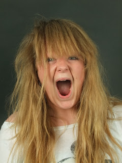
I went into the studio and took some photographs of a model I am using for my front cover:
I like the pose of the model in this photograph, the issue is the lighting. I needed to adjust the lighting to prevent the shadow exemplified behind the model in the photograph.
I wont be using this image in my magazine.
I turned the brightness up to high and thus there is a unnatural light on the models face which makes the image look a low quality.
I wont be using this image in my magazine.
I like the lighting on this image, it highlights the models face which gives a professional look to the photograph.
Although I like the lighting in the image I think the models hair is covering her face too much and thus I don't think this would look very professional to use on my magazine.


No comments:
Post a Comment