Welcome

Welcome to my AS Foundation Portfolio blog. Here you will find research and planning, construction evidence and evaluation for my coursework.

Thursday, 9 February 2012

Hazard and rick assesments:

  • Producer: Beth Marley
  • Location: Studio
  • Date: 08/02/2012
  • Hazards which apply to this location and what harm would they cause: Cables- could trip or electricute ourselves, confined space- could be an issue for clostrebphobia, makeup- could exemplify an alergy, electricity- could cause a fire or electricute ourselves, lighting- could set a fire, slipping/tripping - could become unconcious or injure ourselves.
  • Whats the likely hood of this happening: As long as both me and the subject being photographed follow safety rules and regulations then there is an unlikely chance of any harm coming to either of us.
  • How will it be managed: If we were to come across a harmful sitation we would alarm a ember of staff.


  • Producer: Beth Marley
  • Location: Hardwick Park
  • Date: 08/02/2012
  • Hazards which apply to this location and what harm would they cause: Access- it isnt always open so need to ensure we go when its open or we could hurt ourselves and nobody we be around to help, animals- we would have to make sure we keep out of the animals way as we may cause them distress, public- i need to ensure the public is not in any photographs without consent, makeup- an allergic reaction could occur, water- we would have to keep out the way of the water as we could slip in
  • Whats the likely hood of this happening: As long as both me and the subject being photographed follow safety rules and regulations then there is an unlikely chance of any harm coming to either of us.
  • How will it be managed: If we were to come across a harmful sitation we would alarm a member of security/staff.


  • Producer: Beth Marley
  • Location: Gig location
  • Date: 08/02/2012
  • Hazards which apply to this location and what harm would they cause: Public- i will have to ensure i photograph non of the public and that they are all ok with me taking pictures in their presence, cables- i will have to ensure i trip over non of the instrument cables when taking photographs, costumre/makeup- i will have to ensure there is no allergys or restrictions, electricity- we may electricute ourselves or cause a fire, fire- have to ensure the plugs arent overloaded, glass- have to makesure no glasses get smashed so nobody is at risk of harm, lighting- the lighting may be too bright so its painful to someones sight or it may set alight.
  • Whats the likely hood of this happening: As long as both me and the subject being photographed follow safety rules and regulations then there is an unlikely chance of any harm coming to either of us.
  • How will it be managed: If we were to come across a harmful sitation we would alarm a ember of staff at the location who would know how to deal with the situation effectively and quickly.

Tuesday, 7 February 2012

Recce of location:


Potential locations:
Photo-graph:
Suitability:
Additional comments:
Studio
Cover page, contents page
It will be lit well with a 3-point lighting set up so the image will be a good quality and look professional.

Hardwick Park
Main

The background will be spacious and picturesque; this will enable me to get a good establishing shot with the subject as the focus point.

Gig location
Contents page
This will exemplify the music genre of my magazine and ensure it is in the interest of the readers. Also many professional music magazines have gig photographs embedded so it will make my magazine look of a higher standard.

Bedroom setup
Contents
Many of the indie pop music magazines have images of their subjects in a bedroom type set up with the typical indie look with posters etc in the background, this will help my target audience relate to the magazine.

Monday, 6 February 2012

My audience profile:

Improvements of flatplans:

After an re-analysis my flat plans with the prior feedback from a selected group in mind i decided to redesign my flat plans. I wanted to make particular improvements to better my magazine and ensure it fits the target audience, thus i redrawn my cover page, contents page and double page spread:

Friday, 3 February 2012

Planning my article:

Content- My article is a one on one interview with a member from up and coming indie pop band, which is the music my target audience listen to. In this interview i intend to discuss matters such as gigs, new releases and success as i think they will be topics of interest to the reader.
Narrative voice- I also intend on using first and second person narrative, i think this will create a more 'matey' feel and show that the reader is of equal status to the interviewer, i believe this is the best option as if i was to use a third person narrative i think there would be a distance in the tenor created and this may reflect badly on the magazine as it may then be seen as if they are trying to be of a higher status, something the target audience aren't likely to appreicate.
Lexis- Individualistic and words of a similar class are the types of words i need to focus on embedding in my article are this are the 'buzz words' which when caught the target audiences eye it will ensure them that the magazine fits their personal interests and style. I also need to include technical words relating to music when necessary as this will show the reader 'my magazine' knows what it is talking about and thus be of a high quality.
Introductory paragraph- As my target audience is music passionate indies who love discovering new up and coming artists i will some what explain the artist i am interviewing and ensure i mention words such as new, exclusive and up and coming as these will gain the readers focus as they will realise the article is a gate way to new music. I will use exclamation marks, large significant fonts, under-lining and colour to convey both the importance and dramaticness of the article. 
Extra text- I think it would be a good idea to include some extra text, such as an exclusive play-list or some tour dates, this would add extra depth to my article providing the reader with more knowledge of the band i am featuring, also it would make my magazine have a sense of exclusivity as other magazines will not feature such information thus my magazine will be a strong competitor to the already professional magazines out there which focus on the same genre of music as me.


Wednesday, 1 February 2012

Image anaylsis


I like how the image is split into four separate boxes but all concentrating on the word 'love' wrote on the subjects hand, this word is obviously significant and by using this technique it immediately draws the audiences attention to it. I also like how the photo has been took in black and white, this adds simplicity and takes the focus of the costume and setting, thus the focus can be on the word 'love'. Its interesting to note on none of the images you can see the subjects eyes, this exemplifies mysteriousness as the audience will question his emotion,crying or stressed etc, especially on the top two images. The image in the bottom left hand corner is probably my favourite as the subject looks strong and like he is about to fight 'love' as he has his the fist with 'love' wrote on up and you his eye line is above the top of the image conveying power. The set of images resembles a storyboard of the subjects journey, the audience will like this as they will understand the subject and thus feel closer to them.

 I like how the subjects of the photograph have been placed, due to the different levels and poses it gives a sense of spontaneity to the photograph. Although the background is very picturesque the subjects of the photograph are the focus of the image, i think this is because each one subject is pulling a strong pose and/or facial expression. I think it is good how the subjects are made to look like a ordinary group of friends, this creates an equal status between them and the reader which will make the reader more interested in the article/photograph/band.

Tuesday, 31 January 2012

Peer assesment of flat plans:

I conveyed my flatplans and ideas to a selected peer group, the feed back they gave me was:
- work around the center fold on the double page spread
- ensure the house style is continued onto the double page spread
- use a variety of subjects and camera shots for the photographs
- use mise-en-scene to connotate the genre


Thus, i took the feedback into consideration and decided i was going to use it in order to improve my magazine, make it a higher standard and gain a level four mark. I am going to concentrate on the layout of the double page spread in terms of text and image as i don't want them to cross the center fold as this will almost distort the image/text and make the readability difficult. To make sure my magazine looks a whole product i am going to use a house style, which involves using the same colours and fonts throughout my magazine, this will prevent the magazine looking like a random collection of pages and more like a consistent product. As i am using several images in my magazine i need to ensure i use a variety of subjects for my photographs as a professional music magazine doesn't just exemplify one subject/artist, this helps the magazine appeal to more people in the target audience as not all of them will like one particular artist. Also, concerning the images, i am going to use a variety of shots and manipulate the photographs appropriate to the genre to help draw attention to specific facial expressions and mise-en-scene which are connotative of the genre; i will use camera shots such as zoom, close up, mid close ups etc. When choosing the mise-en-scene i am going to be particular, i want to use costumes and props which link with the inde pop genre i am projecting in my magazine- i will use props such as acoustic guitars as these are a instrument used frequently in this genre of music and i will use costumes which the target audience are likely to wear which stand out and signify individualism.

Flatplans:

The following images are my flat plans for my indie pop music magazine. I have created a cover page, contents page and a double page spread.


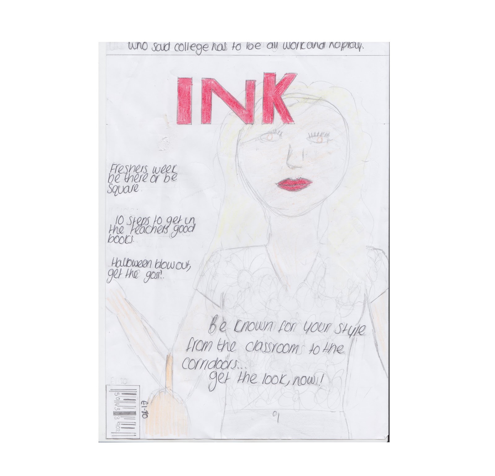
I considered different stylistic decisions when creating my flat plan for my cover page. I thought a formal looking mast head would be the best option as it creates a feeling of high quality to my magazine. I stuck to one font for my sell lines, with exception to one of them, and just ranged the boldness level and size to create depth and bring the key words which to the target audiences attention as these are the main selling points of the magazine. The sell line in the bottom right hand corner is something to take note of, i wanted to make it look like it had been scribbled on last minute to make it seem like last minute exclusives have been put into the magazine, i think this contrasts well with the formality of the masthead as it exemplifies the rough and ready spontaneity of the target audience. I decided using the house colour scheme of red black and white would be most effective as red is a bold colour which is not afraid to stand out, something which the target audience will relate to. I want my main image to be a medium shot of one model, i think by doing this it will prevent the cover from looking too over crowded and thus make it the standards of professional magazines which are already on the market; i also left a 1cm gap from the sides of all the pages to create the professional look as the magazines i have researched seem to have a similar thing. I put the price and bar code in the bottom left hand corner to keep the attention off the price of the magazine so the potential buyer wont be put off.


I decided to use the magazine masthead in the contents page as well, this ensures the buyer knows what magazine they are getting and also it can be a selling point as some people these days buy brands to follow trend and/or fit in so by seeing this masthead they may be encouraged to purchase it. I want to include six images on my contents page, each of these images will relate to one of the articles in the magazine and they will also include the page number they are featured on and a little information about the article, this will hopefully do three things, make the contents page differ from the norm, look more athletically pleasing and make it easier to navigate round the magazine- all of these will help my magazine be of a higher standard.


I have kept my flat plan for my double page very simple, this is to exemplify the simplicity that i want to create. I want the main image to be the focus of the page as i feel too much text can be off putting and the image will hopefully draw the attention of the reader to the article. I intend on using the masthead also on this page, the house theme and the model from the cover page for this photo. The box on the left of the main image i want to have the article story in, i want this detailed and interesting. The box to the right of the main image i want to be questions and answers, i want the questions to relate to the article and to be 'exclusive' and full of interesting details/gossip. In the right box i have drawn two smaller boxes, these are for two smaller images relating to the subject of the article.

Tuesday, 24 January 2012

Primary Target Audience

I conducted some primary audience research in order to find out what appeals to my target audience, to find potentially improvements i could make, to identify any gays in the market and to replace a freshing new twist on the genre i've selected.


These were the cover page, contents page and double page spread i shown to the target audience i sampled. I chosen Kerrang! magazine as it is similar in genre style, plus i have previously analysed it.


For my research i asked ten questions to each person from a selected sample of my target audience:
What attracts you to the magazine? Why?
Do you like the colour scheme? Why?
What do you think of the main image?
Is the contents page easy to use/navigate and understand? Why?
What do you think of the images used on the main article?
Would you pick this magazine up off the shelf in a shop? Why?
What 3 things do you like about the magazine and why?
What 3 things would you improve about the magazine and why?


Main points made during feedback:
Vibrant colours which work together.
Yellow- vibrant and stands out.
Red- danger and brings intrest.
House theme use all the way through. 
Colours to connotate them/genre.
Images, bold and stand out, subjects looking directly at camera.
Bold page numbers and images on contents page help with locate articles/pages.
Titles relate/interest target audience, ie 'teen' and 'sex drugs and violence'.
Effects on masthead, font is 'scratched out'.
Detailed images. tattoos and facial expressions connotate magazine genre.
"Rough and ready"
Make image on double page spread more intrest and in depth, like the one on the cover


Below are a list of stylistic descions i'll make for my product due to the audiences feedback:
- Keep a house style
-Use colours which connotate the genre/target audience
-Make sure the images are eye catching and detailed (clothes, mise-en-scene, facial expressions) to connotate the genre of the magazine, a prefrence seems to be when the subject is looking directly into the camera lense.
-Use easy to read text, make the font on the masthead stand out and be interesting.
-Use language which will interest the target audience
-Make the contents page layout easy to navigate round. Use bold numbers, subheadings and images to make locating stories easier for the reader.

By doing the above i think my magazine would be of a high quality and to a professional standard, also fit the genre/target audience perfectly- all of these would encourage more people to purchase my magazine over others.

Monday, 23 January 2012

My Target Audience:

With thanks to my research i have discovered key features of my intended audience which will affect my magazine over all look and the contents.

Age- 16 to 25.
Gender- Predomantly male, but with an interest from females. Probably, 60:40.
Style- Individuallistic and out of the ordinary; standing out
Music intrest- Indie pop/rock
Intrests- Music related products/hobbies such as gigs and albums, also fashion/style.
Media impacts- Social networking sites


All of the above will help me ensure my magazine meets the interests/needs of the target audience. The fact the age is 16 to 25 the majority of the consumers will have jobs and therefore be able to fund gigs, festival and cds therefore i'll include details, dates, promotions, updates and purchasing offers of the prior things. As the intrests of the target audience are also fashion/style, alongside music, I will include fashionable music icons and website of where the reader might finder similar products as they are likely to want to look like them; I also must make my magazine athetically pleasing as they are not going to want to spend money on something which doesn't look good nor meets their standards. As the target audience is in to social networking sites i think it'd be a good idea to embedded music stories related to social networking sites as they will find this off intrest, also maybe be able to suscribe for the magazine cheaper than normal if subscribed on Facebook or something. The predominantly male gender will be exemplified in the main image as it will be a female subject with a sexual factor which will persuade them to purchase the magazine, and hopefully the fact the subject is female and successful will persuade females to purchase the magazine as they may inspire to be her. The gender split will also be exemplified with the colours and articles I include in the magazine, I will aim to try and satisfy both using colours and articles which appeal to both genders.

Secondry Audience Research

The genre of music for my magazine i am doing is indie/rock, similar to magazines such as Kerrang! and NME. I choose this genre as it is the type of music i listen to and therefore i know more about that then alternative genres, also i will find this the most engaging and intresting to do research on.

I used readers profile to see the particular magazines target audiences prefrences, interests and products they buy- this helps to statisfy during production, to come up with advertising strategies and to identify their main interests.

Readers profile for Kerrang!..

Kerrang's! 15-24 year old readers (60% male
40% female) are sharp,
 intelligent and rejoice in their individuality.
Typical of modern youth, media savvy
and marketing-averse, they are active
consumers of computure games, media
and fashion. On average they buy 31
albums a year (!). The brands that make
the effort to talk to them in their language
are rewarded with enourmous loyality.

Median age: 19
58% think its important to look well dressed.

Kerrang! plays a crucial role in the UK rock scene and celebrates all that is fresh and new.
Kerrang! is a consistent bastion positivism that tells it straight and speaks to the readers with the same fervour with which they buy music, gig tickets, trainers, jeans and T-shirts.
Fashion is of the up most importance to the Kerrang! reader, as they mimic the look of their rock heros. Expressing their different tribal looks of extreme sports, skate-rock, punk and metal.
It is seen as an integral part of the 'scene' rather than simply commenting on events.

After looking at this readers profile i have noted that the median age for the readers of Kerrang! is 19 and 20% more males read the magazine than females. Therefore it may be a good idea to use a female artist on the cover which females aspire to be and therefore purchase the magazine, the female model will need the 'sex appeal' to also attract the males to the magazine- although males is not the worry as they are evidently already intrested in the magazine. The magazine also must be athetically pleasing and name drop specfic impressive brands as 58% of the readers think it is important to look good and therefore will be attracted to a good looking magazine. I think it is important to feature a lot of bands/artist as on average the target audience buy 31 albums a year therefore they are clearly intrested in music.

Textual Analysis:

Friday, 20 January 2012

Research into institutions that distribute similar magazines.

Owner/Publisher -Bauer Media


http://www.mediauk.com/owners/88/bauer-media
http://www.bauermedia.co.uk/Brands

Kerrang!, MOJO, Pop,  Q are a range of magazine's which Bauer Media publish. These magazines focus of different genres of music from mainstream to niche, Bauer Media will have selected these magazines to publish so they have a greater target audience and thus sell more magazines and make more money. Bauer Media are also sell magazines concerning women's and mens lifestyle, equine, gardening, transport, football, golf, pets, angling, motorcycling, outdoor, photography, automotive BRB, motoring. There brands also include a wide variety of radio stations.
Bauer Media conveys Kerrangs! audience is "Young, individually minded and passionate consumers, an audience defined by attitude, passion and loyalty" and they say "Q's audience is composed of passionate, engaged and open minded music fans driven to continually discover new music - and to use this lust for discovery to influence their friends. The audience is split 75% male to 25% female and is affluent" and "The MOJO audience is predominantly male and affluent. Thus i think my magazine would be of interest to Bauer Media as my magazine's target audience is not just males nor females, i am to interest both genders with particular tools such as colour and articles of both their interests. Also, my target audience is young people who relate to music, who listen to music to feel something, who when desrcibing their life mentions music frequently- youth passionate of niche artists, therefore youth's who aren't afraid to be different and stand out from the crowd by buying the magazine and listening to the music. I don't intend to make my magazine pricey and therefore it is not just for the affluent, i want it to be accessable for anyone who wants it. For those reasons i believe Bauer Media would publish my magazine as it is noticably different to the others they currently publish.

Brief: Print

Preliminary exercise: using DTP and an image manipulation program, produce the front page of a new school/college magazine, featuring a photograph of a student in medium close-up plus some appropriately laid-out text and a masthead. Additionally candidates must produce a DTP mock-up of the layout of the contents page to demonstrate their grasp of the program.

Main task: the front page, contents and double page spread of a new music magazine.
All images and text used must be original, produced by the candidate, minimum of FOUR images per candidate.

Friday, 16 September 2011

Cover and Contents

For my cover page i wanted to use neutral colour's combined with a bright red as this will stand out, i took insperation from the Vogue cover page. I tried not to cover the main image with any of the sell lines, after looking at the Elle cover page i think it looks more professional and prevents the cover page from looking to cluttered. I put the price in a small sized text at the bottom of the page as i believe it's at the top of the general price range and i didn't want that to off put the potential customers.
For my contents page i took insperation from both the Vogue and the Elle contents pages; i used the idea of using only one image from Vogue as i think it prevents the attention being took of the contents information, also i used the idea from Elle of writing the contents information on something that's related to the topic (in this case a school work book as its a college magasine). I also labeled the pages in higher numbers (the hundreds) as it makes it look like there are more pages in the magasine and then the customer will buy it as they think they getting more money for therefore are more likely to purchase it. I have continued the house style on to the contents page by using the neutral colours and the bold red.

Tuesday, 13 September 2011

Inspirational texts

The first thing you notice when looking at the cover page is the main image, the black in the main image is a much bolder colour than the subtle pink used in the background so its stands out. The main image also covers some of the mast head which is interesting as most magazines sell due to the brand name. I like how the three colour rule has been used and so the cover page doesn't seem to overpowering or cluttered.

The pages have been numbered in higher numbers (eg 418, 422) so it appears there are lots of pages and therefore you are getting more for your money. It looks like the contents page has been placed on top of a collage of different images, so although it makes the contents page more interesting and conveys what is inside the magazine it doesn't overpower the information on the contents page.

The hot pink colour of the text on the sell lines really 'pops out' against the neutral colours used on the rest of the cover page, this draws the eye to the magazine which will sell. I like how the sell lines have been positioned, they are framing the main image instead of covering it, this prevents the cover page looking to cluttered.

There has only been one imaged used on the contents page, i think this is good as it doesn't overpower the text. Banners have been used to arrange the different sections in the magazine so it is easier for the reader to see what the magazine is offering. 

Brief: Print

Preliminary Exercise: Using DTP and an image manipulation program, produce the front [age of a new school/college magazine, featuring a photograph of a student in a medium close up plus some appropriately laid out text and masthead. Additionally you must produce a mock up of the layout of the contents page to demonstrate your grasp of DTP.

Main Task: The front page, contents page and double page spread of a new music magazine. A minimum of four images. All images and graphics must be done by you.