Welcome

Welcome to my AS Foundation Portfolio blog. Here you will find research and planning, construction evidence and evaluation for my coursework.

Monday, 20 February 2012

Final article:


Yellow magazine caught up with the lead singer of the up and coming indie pop band Vacants Joseph Mellors, the once bedroom music junkie who recording and producing music from his hand me down equipment from the comfort of his own bedsit, to give you the behind the scenes dishiest dirt. The 19 year old London boy reveals all from his rock star lifestyle, from the late night booze ups to how he made his dreams reality.

So Joseph, have you always been an indie kid?
Call me Joe; erm yeah, I have always been into the individual fashion, y’no the outgoing shirts which when you look back in ten years time you will regret *laughs*, and the ideas behind the indie music, saying that it wasn’t until may 2OO8 when I discovered my love for making indie pop until then I was just a loyal listner.

I see I see, who where your major influences then?
The Narrative was and still is a band I am really into! I’ve seen them live six times now; I’m a huge fan- like a kid at Christmas when I have the chance to see them. The Narratives track `cold case’ is the song that inspired me to have a fiddle with my step dads old equipment, so I guess they are kind of the reason I am the artist I am today.

Step dads old equipment did you say?
Yeah yeah, erm, he recorded and produced music back in his day, he was into all that pop rock. He is now Vacant's manager, we probably wouldn't be where we are today without him. What a guy ey! Plus he keeps me and the guys on the straight and narrow, I mean at 19 year old I just cant turn down a good old party *laughs*.

Party animal are you Joe? Give Yellow the dirt on your latest wild night..
*Laughs* Which 19 year old Hackney kid isn't, there is nothing I love more than going out with the lads and getting smashed and up to no good- it's what us fella's do best after all. My last night out? Erm? Is it bad that I can't remember too much after playing drinking games in my mates pad. *Joe covers his face and laughs* What can I say, I love jager, sorry mum.

Is your mum the only lovely lady in your life right now, is there room for a bit of love?
My mums my number one lady, I mean how could I go on with out that delicious chicken korma of hers *laughs*. On a serious note, I am single Yellow yep, it's not because I don't have time to pamper a little rock chick but it is just I haven't yet found the right girl who will put up with my crazy ways.

Tell the single Yellow females what your perfect girl is then?
Hmm, tough one! I would have to say smaller than me, I'm not crazy fussy on fashion just someone who looks good, pride in apperance and all that jazz, hmmm, then the genral, funny, caring and very importantly as passionate about music as I am. I am sure Yellow will set me up on a lovely little blind date yeah *laughs*.


Personal lifeaside, your music career then, how did it start and how do you want it to continue?
Well, my step-dad heard me and the lads in my little bedroom fiddling about recording some indie pop of our own after been a fan for so many years, he kind of told me how good we were and got some of his mates from the bizz' to listen to a demo of ours. My step-dad came back saying we had potential in this niche in the market and I kind of laughed it off, I just never thought I would be able to follow suit in the music world so I just stuck to making my way as a music sensation; after recognition from various music labels my step-dad finally gave us that encouraging push into the music world but I refused to do it without him as he was really the reason for me doing it and so he became Vacants manger. I am over the moon with how well we have done, Vacant was always just a hobbie, a pass time after our day jobs y'know, it's just all a bit unbelivable. I am too excited for the future I know there is some great things lined up for the next year and so for us, we are just beginning a very exciting journey.

So, is their any tours or gigs us at Yellow should be keeping our eye out for?
Well I can't give too much away in terms of fesivals or I will get shot off the boss, but I just am crossing my fingers for the following deals we have, I believe I'm allowed to say Leeds Festival is on the horizon at the moment. Erm, then us and the guys have been sitting down discussing maybe a tour at the end of the year, we will keep use up dated. But at the moment we are focusing on our new and upcoming album and our small but regular gigs down Hackney.

Well Joe, Yellow has found it a pleasure speaking to you and we all wish you the very best for the future..
I would just like to say from me, Sean and Damian thanks so much for all the support and we hope to see you guys at Yellow in the near future. All use music kids out their follow your dreams, dont be afraid to break the boundries and stand out, and all that jazz *laugh*, I sound like my mum *laugh*. Thanks again, over and out! *laugh*

Action plan:

Commencing 7th February.

This week I am starting my production on my magazine. I have a rough cut deadline for Wednesday 2nd March to work towards. Thus I need to organise my time to ensure I meet the deadline.

Main article draft - 14th February 
I have set myself this deadline as I feel I will be able to research, plan and create a draft of my article for my double page spread by this time. 

Photography - 20th February
I have set myself this deadline as I feel it is a reasonable length of time to get my photography done from now - considering I am doing location and studio shoots.

Full construction of Magazine - 1st March
I have set myself this deadline as I know I will be able to meet this as it gives me sufficient time it also gives me a one day gap from deadline day for any specific changes I need to make

As I follow this action plan i will have to ensure I constantly update my blog, showing my progress with posts and print screens.

Research and planning feedback:

Thursday, 9 February 2012

Font research:

I have came across the website Dafont, http://www.dafont.com/theme.php?cat=107&page=4, here i have found some intresting fonts which i think would be effective to use on my masthead as they fit the genre of the magazine and look more athetically pleasing than a font from a general piece of software like microsoft word.

  • http://www.dafont.com/load-up-on-guns.font - 'Load up on guns' is a font from Dafont which i think would be very good for my masthead as it exemplifies original formality with the formal yet scratched out text.
  • http://www.dafont.com/birth-of-a-hero.font - 'Birth of a hero' is a font from Dafont which i think is very attention grabbing as a rough taste on a modern font, this exemplifies the target audiences style so i believe this would appeal to them.
  • http://www.dafont.com/old-press.font - 'Old press' is a font from Dafont which i think that would look good as it resembles the old fashioned look, this is something which i believe will be of intrest to the target audience as you notice them to wear a lot of clothes which were very popular in the 'olden days'.
  • http://www.dafont.com/rough-typewriter.font - 'Rough typewritter italics' is a font from Dafont which i think would be effective on my sell lines as it is easy to read but still conveys the rough and ready look i am aiming for.

The fonts i have researched above are not the definite fonts i am using in my magazine, during the production process i will come to a final choice upon this matter as i am not yet sure if these fonts will fit well together and look athetically pleasing on my magazine, but i am deffinitly taking insipration if anything from both these fonts and Dafont website.

Test photographs:

I took some test shots of a friend, they are mainly in the studio in which I am intending to take my cover page image. I did this so I could get to grips with the camera, so I knew what type of makeup worked and so I knew what type of shots I thought would and or wouldn't work on my magazine. Here are some of the test shots:


I think this extreme close up shot is one I may consider using for my contents page, I don't think it would work on my cover nor my double page spread. I like the 'stare into the camera' look that has been created here, I think it makes the image gain a lot more depth.


Similarly to prior one this is a style of image I may use on my contents page, or maybe this could work on the double page spread; but I don't think it is a strong enough image for the front cover. I like the subtle use of a prop (the bag) this is something I am going to have to take into consideration when taking my photos for magazine as a simple prop can really add a lot to a photograph.


I really like the angle of this image, I think it makes the model look of a important status', something which you see done in other music magazines with the artists been photographed. I am not sure of the pose that the model has done here, I think I prefer a direct gaze from the model to the camera.


A full body shot is one I may consider for my double page spread, although I am sure I will use one of these style shots on my contents page also.


This image is an example of the model not being the only thing in the frame, in this case it is the window and whats outside, this is something I will take into consideration as after analysing other music magazine I have noted that the models either have props or are in a frame with a interesting background (not a studio), this adds depth and realness to the photograph.


A mid-shot it something I am likely to use for my main image on my front cover as it exemplifies the model in enough detail and keeps them in the focus, this is a shot which most professional magazines have on the cover. Also, I think the setting will similarly be in the studio for my main cover image as too much going on will over crowd the front cover and make it less aesthetically pleasing.

Evidence of props, costume and makeup organisation:


Here i am applying red lipstick to my model, i intend to use a bright red lipstick like this on my cover page model as i want to match the colour of their lips to the masthead. Also i think the red lipstick will be a useful tie in with my house colour scheme (red, white and black). I think the red lipstick will add to my models sex appeal which will be of interest to the male target audience.


Here i am applying a pale covering of foundation to my models face. This is to ensure my models complexion looks spotless which resembles the models complexion in professional magazines due to their fantastic makeup artists. I intend on using a pale foundation as it will make the red lipstick stand out more and be the main focus.

Call sheets:

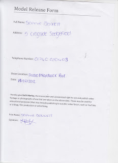
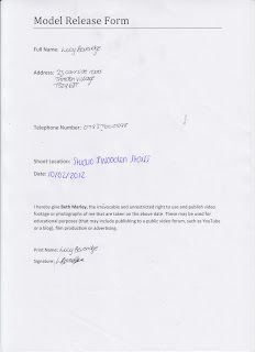
0Below are the call sheets for the models I am using for my magazine photographs. They include an identity photograph of each model, along with shooting date, shooting information and their role within the photo shoot. It also ensures that they have their model release forms signed so that their permission is granted for me to use them for my photography, which will be published online and printed.


Call sheet-

Character: Amber Loizou
Release form signed: Yes
Shooting day: 10/02/2012
Location: Studio
Producer: Beth Marley
Location: Beth Marley


Call sheet-


Character: Sophie Bennett
Release form signed: Yes
Shooting day: 11/02/2012
Location: Studio
Producer: Beth Marley
Location: Beth Marley


Call sheet-
Character: Lucy Beveridge
Release form signed: Yes
Shooting day: 10/02/2012
Location: Studio
Producer: Beth Marley
Location: Beth Marley


Call sheet-


Character: Joseph Mellors
Release form signed: Yes
Shooting day: 11/02/2012
Location: Hardwick park
Producer: Beth Marley
Location: Beth Marley


Call sheet-

Character: Josie Bolam
Release form signed: Yes
Shooting day: 11/02/2012
Location: Bedroom set up
Producer: Beth Marley
Location: Beth Marley


Call sheet-

Character: Luke Maddison
Release form signed: Yes
Shooting day: 14/02/2012
Location: Gig location
Producer: Beth Marley
Location: Beth Marley


Call sheet-
Character:Jacob Stephenson
Release form signed: Yes
Shooting day: 14/02/2012
Location:Studio
Producer: Beth Marley
Location: Beth Marley

Model release forms:


The following forms are my model release forms for the models I am going to photograph for my contents and front cover page. The form contains their consent for me to use their images in production of my magazine and to be published online or in this blog:


Hazard and rick assesments:

  • Producer: Beth Marley
  • Location: Studio
  • Date: 08/02/2012
  • Hazards which apply to this location and what harm would they cause: Cables- could trip or electricute ourselves, confined space- could be an issue for clostrebphobia, makeup- could exemplify an alergy, electricity- could cause a fire or electricute ourselves, lighting- could set a fire, slipping/tripping - could become unconcious or injure ourselves.
  • Whats the likely hood of this happening: As long as both me and the subject being photographed follow safety rules and regulations then there is an unlikely chance of any harm coming to either of us.
  • How will it be managed: If we were to come across a harmful sitation we would alarm a ember of staff.


  • Producer: Beth Marley
  • Location: Hardwick Park
  • Date: 08/02/2012
  • Hazards which apply to this location and what harm would they cause: Access- it isnt always open so need to ensure we go when its open or we could hurt ourselves and nobody we be around to help, animals- we would have to make sure we keep out of the animals way as we may cause them distress, public- i need to ensure the public is not in any photographs without consent, makeup- an allergic reaction could occur, water- we would have to keep out the way of the water as we could slip in
  • Whats the likely hood of this happening: As long as both me and the subject being photographed follow safety rules and regulations then there is an unlikely chance of any harm coming to either of us.
  • How will it be managed: If we were to come across a harmful sitation we would alarm a member of security/staff.


  • Producer: Beth Marley
  • Location: Gig location
  • Date: 08/02/2012
  • Hazards which apply to this location and what harm would they cause: Public- i will have to ensure i photograph non of the public and that they are all ok with me taking pictures in their presence, cables- i will have to ensure i trip over non of the instrument cables when taking photographs, costumre/makeup- i will have to ensure there is no allergys or restrictions, electricity- we may electricute ourselves or cause a fire, fire- have to ensure the plugs arent overloaded, glass- have to makesure no glasses get smashed so nobody is at risk of harm, lighting- the lighting may be too bright so its painful to someones sight or it may set alight.
  • Whats the likely hood of this happening: As long as both me and the subject being photographed follow safety rules and regulations then there is an unlikely chance of any harm coming to either of us.
  • How will it be managed: If we were to come across a harmful sitation we would alarm a ember of staff at the location who would know how to deal with the situation effectively and quickly.

Tuesday, 7 February 2012

Recce of location:


Potential locations:
Photo-graph:
Suitability:
Additional comments:
Studio
Cover page, contents page
It will be lit well with a 3-point lighting set up so the image will be a good quality and look professional.

Hardwick Park
Main

The background will be spacious and picturesque; this will enable me to get a good establishing shot with the subject as the focus point.

Gig location
Contents page
This will exemplify the music genre of my magazine and ensure it is in the interest of the readers. Also many professional music magazines have gig photographs embedded so it will make my magazine look of a higher standard.

Bedroom setup
Contents
Many of the indie pop music magazines have images of their subjects in a bedroom type set up with the typical indie look with posters etc in the background, this will help my target audience relate to the magazine.

Monday, 6 February 2012

My audience profile:

Improvements of flatplans:

After an re-analysis my flat plans with the prior feedback from a selected group in mind i decided to redesign my flat plans. I wanted to make particular improvements to better my magazine and ensure it fits the target audience, thus i redrawn my cover page, contents page and double page spread:

Friday, 3 February 2012

Planning my article:

Content- My article is a one on one interview with a member from up and coming indie pop band, which is the music my target audience listen to. In this interview i intend to discuss matters such as gigs, new releases and success as i think they will be topics of interest to the reader.
Narrative voice- I also intend on using first and second person narrative, i think this will create a more 'matey' feel and show that the reader is of equal status to the interviewer, i believe this is the best option as if i was to use a third person narrative i think there would be a distance in the tenor created and this may reflect badly on the magazine as it may then be seen as if they are trying to be of a higher status, something the target audience aren't likely to appreicate.
Lexis- Individualistic and words of a similar class are the types of words i need to focus on embedding in my article are this are the 'buzz words' which when caught the target audiences eye it will ensure them that the magazine fits their personal interests and style. I also need to include technical words relating to music when necessary as this will show the reader 'my magazine' knows what it is talking about and thus be of a high quality.
Introductory paragraph- As my target audience is music passionate indies who love discovering new up and coming artists i will some what explain the artist i am interviewing and ensure i mention words such as new, exclusive and up and coming as these will gain the readers focus as they will realise the article is a gate way to new music. I will use exclamation marks, large significant fonts, under-lining and colour to convey both the importance and dramaticness of the article. 
Extra text- I think it would be a good idea to include some extra text, such as an exclusive play-list or some tour dates, this would add extra depth to my article providing the reader with more knowledge of the band i am featuring, also it would make my magazine have a sense of exclusivity as other magazines will not feature such information thus my magazine will be a strong competitor to the already professional magazines out there which focus on the same genre of music as me.


Wednesday, 1 February 2012

Image anaylsis


I like how the image is split into four separate boxes but all concentrating on the word 'love' wrote on the subjects hand, this word is obviously significant and by using this technique it immediately draws the audiences attention to it. I also like how the photo has been took in black and white, this adds simplicity and takes the focus of the costume and setting, thus the focus can be on the word 'love'. Its interesting to note on none of the images you can see the subjects eyes, this exemplifies mysteriousness as the audience will question his emotion,crying or stressed etc, especially on the top two images. The image in the bottom left hand corner is probably my favourite as the subject looks strong and like he is about to fight 'love' as he has his the fist with 'love' wrote on up and you his eye line is above the top of the image conveying power. The set of images resembles a storyboard of the subjects journey, the audience will like this as they will understand the subject and thus feel closer to them.

 I like how the subjects of the photograph have been placed, due to the different levels and poses it gives a sense of spontaneity to the photograph. Although the background is very picturesque the subjects of the photograph are the focus of the image, i think this is because each one subject is pulling a strong pose and/or facial expression. I think it is good how the subjects are made to look like a ordinary group of friends, this creates an equal status between them and the reader which will make the reader more interested in the article/photograph/band.